The Skinny on Thin Fonts
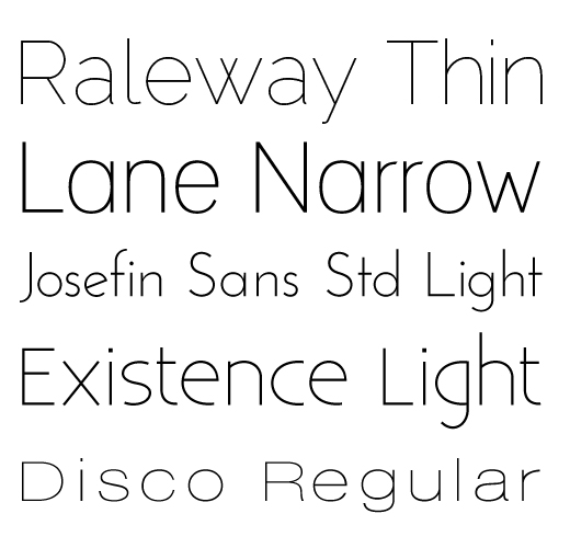
Today let’s talk about very thin sans serif fonts, like the ones shown below. They are usually denoted by a thin, narrow, or light label. For instance, Raleway – Thin.
I like these weights of fonts because they feel light, clean and crisp. They work well when contrasted with thicker font weights, like regular or bold and give design projects a fresh and open look.
Thin fonts come with these caveats: 1) overall they don’t work as well at smaller sizes, 2) in print pieces, if the font size is too small it can be too thin to print. So keep those things in mind.
The following fonts are free for commercial use via FontSquirrel. There are also many, many thin or light weight fonts you can purchase from places like MyFonts.
Now go have some fun with your new font friends Raleway, Lane, Josefin, Existence and Disco.
