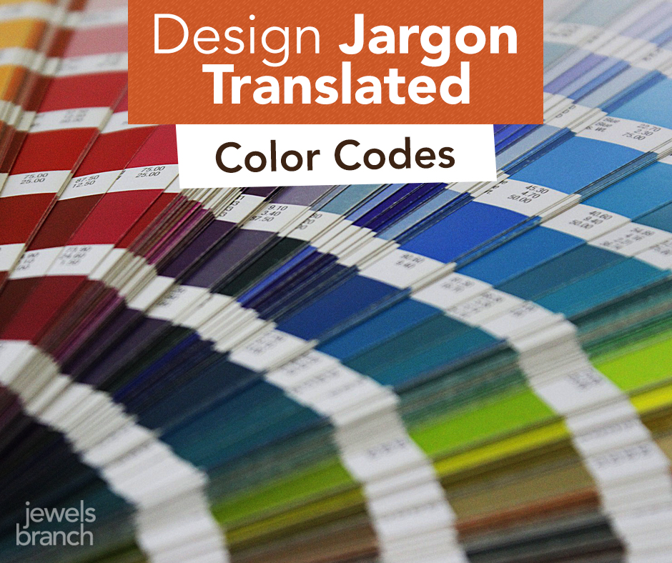
Design Jargon Translated – Color

Do your eyes glaze over when you hear your designer talking geek?
Are you afraid to ask what the heck they mean?
You certainly don’t need to understand every detail of a designer’s job (they are the expert you are hiring, after all). But you shouldn’t sit around feeling intimidated, either.
A basic understanding of all the jargon being thrown your way will help improve communication between you and your designer.
Here are a few tips about color to help you converse confidently with your designer.
To start us off we’ll be talking about what true red looks like. Don’t be afraid, it’s easy!
Your designer says: CMYK
They are talking about: C (cyan) M (magenta) Y (yellow) K (key/black). Inks used in traditional 4-color printing.
To a designer red in CMYK looks like: 0c, 91m, 76y, 6k
Real life examples: business cards, logos, brochures, magazines, catalogs.
Your designer says: RGB
They are talking about: R (red) G (green) B (blue). Light used to show color on electronic devices.
To a designer red in RGB looks like: 224, 58, 62
Real life examples: iPhones, iPads, computer monitors, TVs, digital cameras.
Your designer says: Pantone
They are talking about: special single color inks used in printing, often called spot colors.
To a designer red in Pantone looks like: Pantone 186
Real life examples: logos, business cards, stationary, annual reports where companies want to ensure their branding stays true to color.
Your designer says: hex number
They are talking about: the code used to tell your browser what color to display.
To a designer red in a hex# looks like: #e03a3e
Real life examples: web pages displayed on your computer monitor.
Still confused about color? Shoot me an email. I’ll answer.
Come back next Monday and I’ll translate more design jargon just for you.