Fonts
The Skinny on Thin Fonts
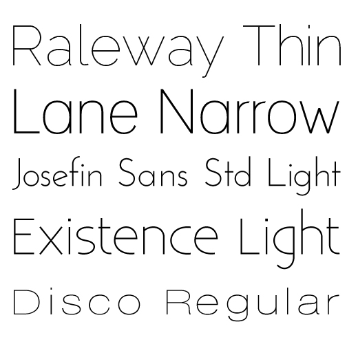
Today let’s talk about very thin sans serif fonts, like the ones shown below. They are usually denoted by a thin, narrow, or light label. For instance, Raleway – Thin.
I like these weights of fonts because they feel light, clean and crisp. They work well when contrasted with thicker font weights, like regular or bold and give design projects a fresh and open look.
Thin fonts come with these caveats: 1) overall they don’t work as well at smaller sizes, 2) in print pieces, if the font size is too small it can be too thin to print. So keep those things in mind.
The following fonts are free for commercial use via FontSquirrel. There are also many, many thin or light weight fonts you can purchase from places like MyFonts.
Now go have some fun with your new font friends Raleway, Lane, Josefin, Existence and Disco.
4 Flowy, Flirty, Feminine & Free Fonts
I have so much fun testing out fonts to find just the right ones for my clients. I particularly like feminine fonts, cause I’m just girly that way.
The following fonts would be great choices for logos or website headers if your personal style leans toward feminine and flowery with a professional feel.
Honey Script No longer available.
Angelina No longer available.
Do you have a favorite font? Leave a comment and let me know, I’m always on the hunt for new fonts to collect.
Good Fonts Gone Bad
Comic Sans & Copperplate have now left the building.
For the record, I have nothing against Comic Sans and Copperplate. Once upon a time they were lovely, lovely fonts. So shiny and full of potential.
Then, every time someone wanted to emphasize a quote, they used Comic Sans. When the vibe was playful Comic Sans showed up to party.
Banks and corporations staked a claim on Copperplate. They wanted Copperplate for their logos and annual reports. Drive by your bank today and chances are the sign out front is typeset in Copperplate.
Overexposed Fonts
Comic Sans and Copperplate, along with quite a few other fonts, suffer from extreme overexposure. Because of that, many professional designers, me included, won’t use them in design. They are no longer considered professional.
As famous fonts (and celebrities) do, Comic Sans and Copperplate have now retired and are sipping margaritas in Mexico. Rumors are they may never come back to the U.S.
They aren’t the first, or last, fonts to fall out of fashion. So what do we do when fonts retire? We find new ones of course!
Finding Better Fonts
There are many, many sites offering free fonts. However, the projects I work on are all commercial endeavors (logos, headers, print pieces, etc.) so I prefer to work with fonts that are professionally created. Some of these fonts are offered for free. Most have to be purchased.
Professional fonts differ from many of the free fonts in two key ways.
1. Professional fonts offer a full range of characters and glyphs. This is better for me because they include copyright marks, other symbols and accented characters like the â in château.
2. Professional fonts are formatted correctly to work with the full range of graphic design software programs I use and to work with the software professional printers use. I don’t have to worry about Illustrator not recognizing the font or my printer calling with a font issue.
Two great places to start exploring fonts are:
FontSquirrel
Hand-picked free, commercial use fonts.
Myfonts
Easy searches for commercial fonts. Great tools to help you identifying fonts you’ve seen elsewhere.
Comic Sans and Copperplate were last seen on a beach in Mexico. I’d like to join them there soon and I’ve promised not to talk design!


