Fonts
Lovely Dingbats for Girly Girls
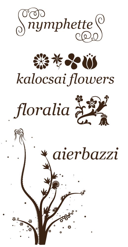
Dingbats are the flourishes in typographic design. In traditional typesetting they were used to fancy up type-heavy pages, spice up titles and separate sections of text.
You’ve probably used the most common dingbat fonts, like Wingdings, Webdings, or Zapf Dingbats to add bullet points or check boxes to presentations or papers.
These are fine for serious business communication, but sometimes your audience is a bit more girly.
The following fonts offer sets of dingbats with bits of flowery, swirly fun for use in marketing pieces that need to speak to a feminine audience.

They are free for commercial use via FontSquirrel.
Go check out the full character set for these lovely dingbat fonts: Aierbazzi, Floralia, Nymphette, Kalocsai Flowers.
Post below to let me know how you’ve used these fonts to add some girly spark to your marketing materials.
We’re Here for the Party Fonts
Turn on the disco light.
Today we’re introducing some funky, funky fonts.
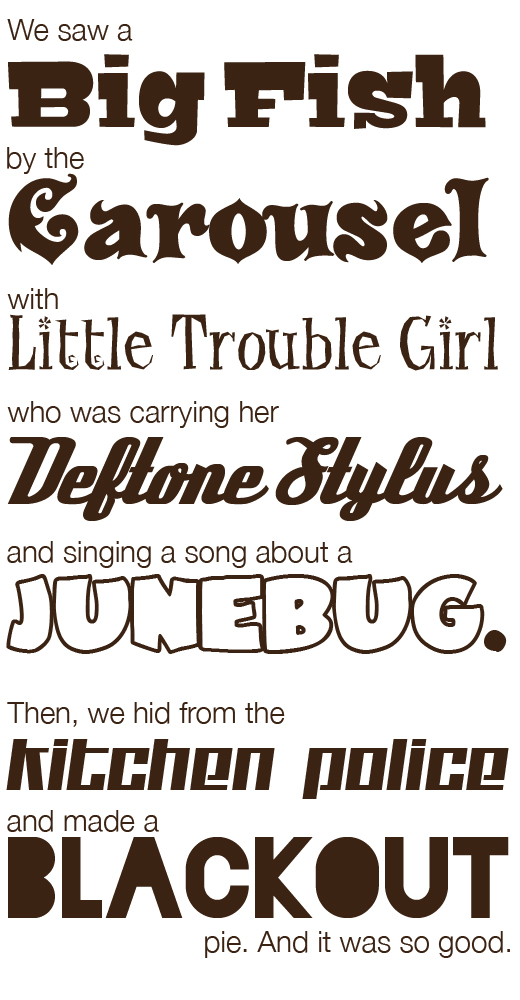
These fonts steal the show, take over the stage and get your “we’re here for the party” message across loud and clear.
Use these make-a-statement fonts when your marketing materials call for completely overboard fun. They are free for commercial use via FontSquirrel.

What kind of story can you make with funky fonts like Bigfish, Carousel, Little Trouble Girl, Deftone Stylus, JuneBug, Blackout and Kitchen Police?
Fun and Sensible Fonts
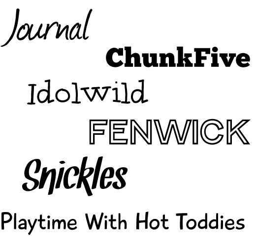
My work often calls for clean, crisp designs and fonts, so when I get the opportunity to mix it up a bit I love to try out fun, decorative fonts. Today let’s look at some fonts that add a bit of zip to the design without being overwhelming.
Since there’s no official designation for fun fonts, you can find them by searching sites like FontSquirrel and MyFonts for fonts labeled or categorized as: comic, display, hand drawn, novelty or funny.
These fonts work best when used for short bits of text: headlines or photo captions, for example. If you plan to use them for longer paragraphs of text plan to use larger font sizes and plenty of space between lines of type. This will make it easier to read.
The following fonts are ones I choose often to add a spark to my designs without going completely overboard. They are free for commercial use via FontSquirrel.

Go give these a try: Journal, ChunkFive, Idolwild, Fenwick, Snickles, Playtime With Hot Toddies.
Next week I’ll introduce you to some over the top, funky, free fonts that are designed to steal the show.