Graphic Design
The Skinny on Thin Fonts
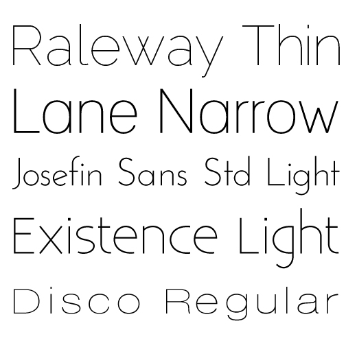
Today let’s talk about very thin sans serif fonts, like the ones shown below. They are usually denoted by a thin, narrow, or light label. For instance, Raleway – Thin.
I like these weights of fonts because they feel light, clean and crisp. They work well when contrasted with thicker font weights, like regular or bold and give design projects a fresh and open look.
Thin fonts come with these caveats: 1) overall they don’t work as well at smaller sizes, 2) in print pieces, if the font size is too small it can be too thin to print. So keep those things in mind.
The following fonts are free for commercial use via FontSquirrel. There are also many, many thin or light weight fonts you can purchase from places like MyFonts.
Now go have some fun with your new font friends Raleway, Lane, Josefin, Existence and Disco.
Design Jargon Translated – Vectors
It’s Monday. Time for me to translate some design jargon into plain English, just for you. Today we’re talking vectors!
Here’s the scenario: Your designer is cooking up a new set of marketing materials for you. You have all the ingredients together. You’ve have copy written, you’ve searched through your files, found a .jpg file of your logo, and sent it all over to your designer and now…
Your designer says: “I need your logo in vector format not raster.”
“What’s wrong with the .jpg I sent?” you ask.
Nothing. It’s perfectly fine, except it’s already baked. Done. Crispy. Toasted. It can only be what it is, just a little .jpg.
Your logo in a vector format is like sugar cookie dough. It’s all ready to be rolled out and cut into shapes. It’s malleable. Smooth vector lines (usually created in Illustrator) allow your designer to scale your logo up, scale your logo down, adjust the color and then save it out into whatever format, size and resolution is needed for the marketing pieces you want.
Your logo in a raster format is like a baked cookie. It’s much harder for your designer to take a raster (.jpg, .tif, .png, .gif, .psd) format logo and make adjustments. It’s like trying to take that baked sugar cookie and give it different shape without destroying it. The only way to do it is to take a bite. Then there you are with a half-eaten cookie and an unprofessional logo.
So now you are on a hunt for your logo in vector format. When you’re searching your files look for a file that ends in .eps or .ai. The most common vector formats.
If you don’t have a vector file of your logo, your designer may want to recreate your logo in vector format. Let them do this. Pay them for the extra work and make sure they give you a copy of files for future use. That way you’ll have the ingredients you need the next time you want to cook up some marketing materials.
Come back next Monday and I’ll explain more about raster files or maybe I’ll just talk about cooking, I’m kinda hungry over here.
4 Flowy, Flirty, Feminine & Free Fonts
I have so much fun testing out fonts to find just the right ones for my clients. I particularly like feminine fonts, cause I’m just girly that way.
The following fonts would be great choices for logos or website headers if your personal style leans toward feminine and flowery with a professional feel.
Honey Script No longer available.
Angelina No longer available.
Do you have a favorite font? Leave a comment and let me know, I’m always on the hunt for new fonts to collect.


