Graphic Design
What’s That Color?
In “Design Jargon Translated – Color” I explain the different ways brand colors are described in design: RGB, CMYK, hex#, and Pantone. These are color specifications and codes that you need to know whether you’re DIY-ing your own branding materials or working with a designer.
Today, I’m going to show you how to quickly figure out color codes for yourself when you find a color out on the web that you’d like to replicate. This is also helpful if you don’t know your brand colors, but have a logo or header you can sample to get those colors.
Mac
 You’ll be using an app called Digital Color Meter. This app lets you sample colors that are on your computer screen.
Step 1) Find Digital Color Meter
Go to your Applications folder, then Utilities folder. Digital Color Meter will be in your Utilites folder. Double click to open the app.
Step 2) Get the color you want to sample up on your screen
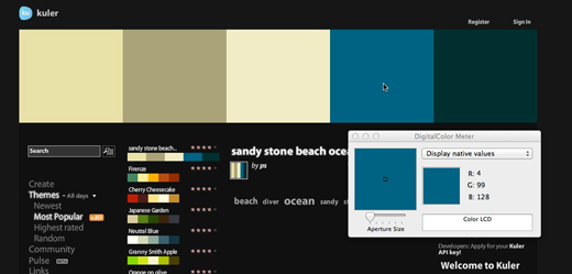
I’ve got Kuler.adobe.com up in my browser and I’m going to sample one of the colors in their palette.
Step 3) Sample the color
With Digital Color Meter active, drag your cursor across the image. Digital Color Meter will show you the RGB values of the color your mouse is over. You just need to write down those values and you’re good to go.
In this screenshot you can see the RGB values of the color my cursor is hovering over: R = 4, G = 99, B = 128
– – – – – – – – – –
PC
 You’ll be using an app called Instant Eyedropper. This app lets you sample colors that are on your computer screen.
Step 1) Download and launch Instant Eyedropper
Go here to download the app and install. You can then add the icon for Instant Eyedropper to your task bar for easy access.
Step 2) Get the color you want to sample up on your screen
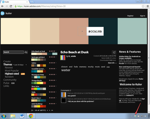
I’ve got Kuler.adobe.com up in my browser and I’m going to sample one of the colors in their palette.
Step 3) Sample the color
Click on the Instant Eyedropper icon in your task bar, hold down with your mouse and drag the crosshair icon up to the color you want to sample. With Instant Eyedropper you can specify RGB values or hex# to be displayed. When you’re over the color you want to sample, release your mouse. The color values are now copied to your clip board. You can open up a Word doc and “paste” the code into it.
In this screenshot you can see the hex# value of the color my cursor is hovering over: hex#CCA18B
– – – – – – – – – –
TIP: If you want to translate RGB, CMYK, and hex# codes go here.
Here’s to consistent brand color usage for all!
Judging Your E-book By Its Cover
Your audience will judge your PDF-style e-book by its cover (even if you are giving it away for free as an opt-in). They will decide, based on how it looks and what it says, if it’s right for them.
How do you want your audience to feel when they see your e-book for the first time? How do you want to present yourself?
Seeing Your E-book Through Their Eyes

First Look
You audience’s first introduction to your e-book may be the 3-d version in the sidebar of your website. Take a minute and jot down any ideas you have about how this might look. If you already have an e-book promotion in your sidebar, take a look at it with fresh eyes. How does it make you feel? Is it enticing?
Second Glance
If they liked what they saw in your sidebar and clicked to download, within a few minutes your e-book will pop open on their screen. For an instant, at least, they will focus solely on your e-book cover. How do you want them to feel in that moment? If you already have an e-book, open it up. Take a look at the cover with fresh eyes. What is the cover saying about you and your business?
Lasting Impressions
You want a cover that is both verbally and visually powerful. A cover that matches your brand visuals and language. A cover that pulls your audience in. You want a cover that is 100 percent you. If it looks like every other e-book cover you’ve seen in the last year it’s time to do better.
3 Steps to Better E-book Covers
Whether you design your cover yourself or hire a designer to do it for you, these three steps are key.
1) Design for Impact
Design a cover that reinforces your brand visuals. This can be as simple as using your brand colors and typography, including your logo, or in the case of a series of e-books, using one consistent design element throughout the series.
Remember, your cover will be reduced to fit into your sidebar. Simple is better. Complex photos, thin fonts,and too much text will not translate at that small size. One quick way to check out how well your design translates to a smaller size is to view it at 25 percent and 50 percent.
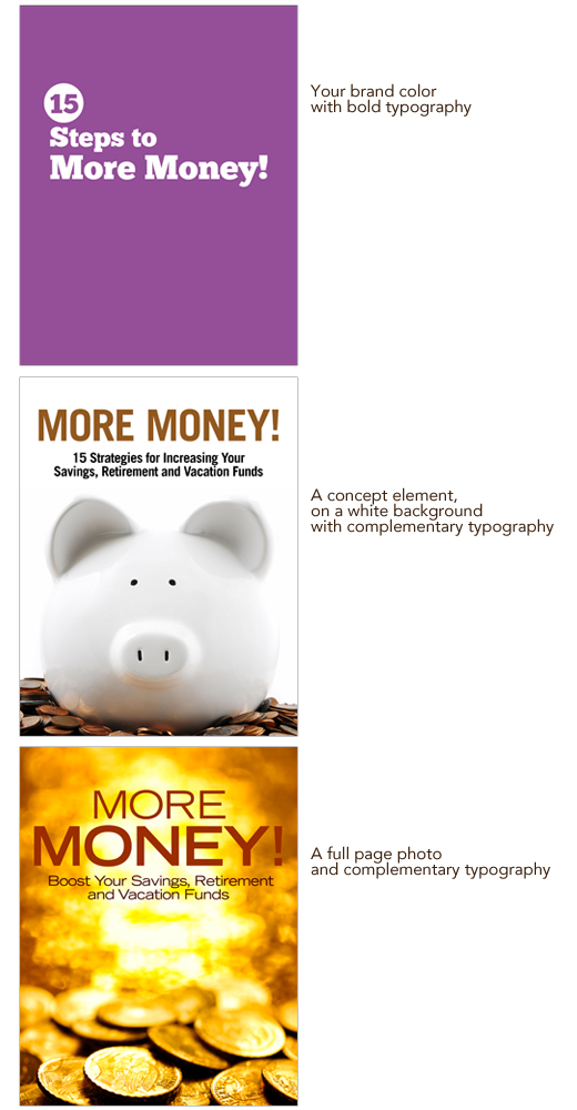
Three simple DIY cover design options you can use.

2) Use Your Own Words
Chose a title reflects you and your brand. You can do this by starting to pay attention and notice your true voice. What phrases do you use all the time? What words light you up and also speak directly to your target audience? What can you pull out of the e-book to use as a title? Tip: Have someone else read your e-book out loud to you, listen for killer phrases that match up with your overall brand and the topic of the e-book.
E-book titles that showcase their author’s brands
Kris Carr – Crazy Sexy Manifesto
Jonathan Mead – Backpack
Danielle La Porte – Fire Starter Sessions
Tara Sophia Mohr – 10 Rules for Brilliant Women
3) Evaluate Honestly
Taking a few minutes to honestly evaluate your cover before it goes out in the world will put you miles ahead of your competition. Ask yourself these questions.
Does this cover reflect my brand?
If you look at your e-book alongside all your branding materials: logo, website, business card, etc. does it fit in? Will your audience know at a glance that this e-book is from you, or will they be left wondering who took over your company?
Is the cover simple and clear?
Will your audience know at one glance that it is for them? Does your title speak in your voice and convey the topic of your e-book clearly?
Is the cover fresh?
Does it look like every other e-book cover you’ve seen, or are you bringing your personality and branding to the table?
Am I proud to have my name on this cover?
If you answer “no” to any of those questions, remember that design is a process. Set the cover aside and come back to it in a few days. Then, take a fresh look at the cover and make note of the improvements you want to make. Make those changes and evaluate honestly again. Repeat as needed until you’re happy with the results.
Birthday Special
Wednesday, Sept, 14th is my 38th birthday.
Last year at this time I couldn’t have imagined how much my world would expand by simply deciding to fully embrace having an online business.
Since last September, I launched my website, started to blog and tweet and connect.
I’ve been blessed to take online classes with brilliant mentors and be coached by some of the finest minds in the business.
I’ve found communities of inspiring women who lift each other, and me, up.
I’ve had the good fortune of finding truth-telling, cheerleading friends who are willing to shine a light for me when I can’t see anything but shadows.
I’ve met so many wonderful women building their businesses online and facing the same struggles as I face. Juggling families and finances and fears. Through it all moving forward.
For my birthday, I want to celebrate my progress and yours.
Christie’s Birthday Special
I’m offering 50% off packages listed here, when paid in full between now and midnight CST, Friday, Sept. 16, 2011.
To qualify for the special
~ Leave a comment below, or email me, which service(s) you’d like to purchase.
~ I will email you back with payment details and how to get started.
Questions? Email me.

