Content Strategy
Make a Plan For Your Next Freebie
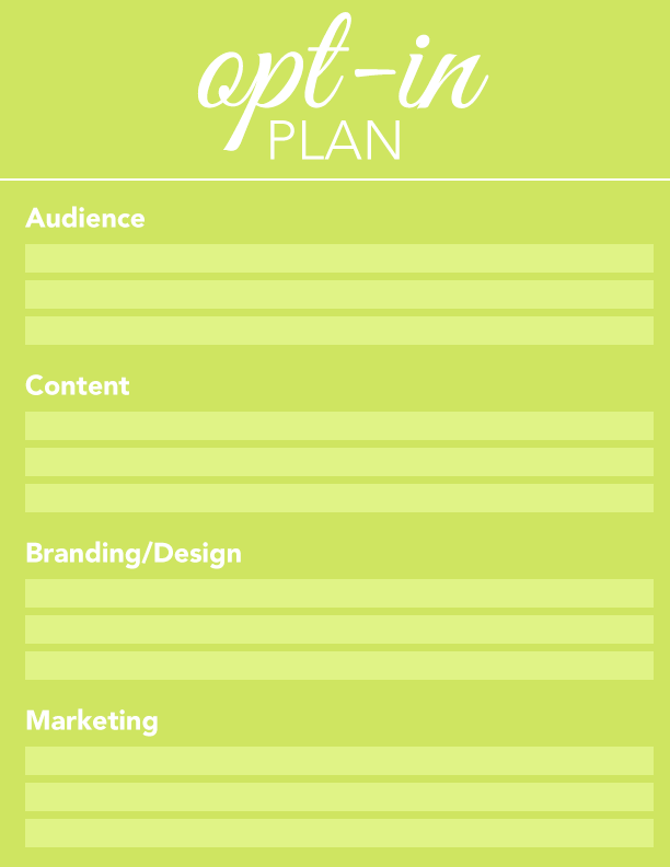
Use our Opt-in Planner to get a big picture view of your next pdf-style freebie or content upgrade
No matter where you are in your business journey — just starting out, or several years in — you already know that growing your list is key to your success. A beautiful, useful pdf-style opt-in freebie, or two, or three, can help you keep that list growing!
Your Plan in Your Inbox
With your list growth in mind, we’ve created an Opt-in Planner (covering four key areas: audience, content, design/branding, and marketing) to help you get started creating your next freebie or content upgrade. Once you’ve answered all the questions and submitted your answers, you’ll get a pdf of your Opt-in Plan in your inbox.
Your Opt-in Plan will help you create a beautiful and useful PDF that fully supports your business goals and … gets downloaded and used (not downloaded and forgotten)!

Sign up to access the Opt-in Planner
Plus you'll get weekly DIY branding tips delivered right to your inbox.
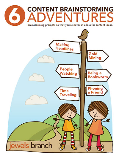
6 Content Brainstorming Adventures

Free e-book! Download here: 6 Content Brainstorming Adventures
This is a sneak peek at a few of the lessons from our Content Brainstorming course.
Let me know if any of the prompts spark content ideas for you!
Want an e-book like this for your biz? Come learn how to create your own!
Come learn how to write, design and promote an opt-in that’s perfect for your clients Opt-in Brilliance.
3 Ways to Improve Your PDF-style E-books
I’ve spent much of my time the last few months reviewing e-books, designing e-books, and teaching a workshop on how to create PDF-style e-books. I’ve been blown away by the depth of knowledge being shared by entrepreneurial women around the world. We are so generous with our knowledge.
I want all that knowledge that you’re sharing to have the biggest impact possible on your audience and bottom line. So, I wanted to share with you three areas in the e-book creation process where everyone could do little bit of tweaking: cover design, brand consistency, and content balance.
The next time you create an e-book do these three things:
#1: Spend more time on your cover
Your audience will judge your PDF-style e-book by its cover (even if you are giving it away for free as an opt-in). They will decide, based on how it looks, and what it says, if it’s right for them.
Do This:
Always create more than one cover option. Play around with different photos, illustrations, typography, colors, and titles.
Print these out and post them on your bulletin board for a few days. See which covers repeatedly draw your attention. Notice which titles roll off your tongue easily and stick in your head.
Put yourself in your ideal client’s shoes and think about how you want them to feel when they first see your cover.
Take your favorite cover options and do another round of tweaks. Repeat this process until your cover shines.
For more information on cover design read Judging Your E-book By Its Cover.
– – – – – – – – – – – – – – – –
#2: Stay on brand
Use the brand you already have to design your cover and interior pages.
You might think this is boring, but being consistent with your brand visuals, from your website to your e-book and beyond, increases brand recognition. This is a good thing, just ask Nike.
Do This:
Use your brand colors and typography throughout your e-book. Include your logo and any other design elements that you use on your website.
If you don’t know your brand colors and fonts, check with whomever designed your logo and/or website to get those. This is important information that you need to have on hand.
Examples of awesome e-books with consistent branding:
Mayi Carles: 5K Sales in 365 Days
Jessica Ainscough: Make Peace With Your Plate
Mindy Crary: Getting Started with Conscious Spending
– – – – – – – – – – – – – – – –
#3: Stop over-sharing
I’m sure you’ve read e-books where the first 10 pages are a mini-biography of the author’s life and you’re skipping through to get to the secret that was supposed to be revealed. Don’t be that person. Save your entire life story for your auto biography.
Your e-book is not about you! Your e-book should be helping your ideal client solve their problem.
Do This:
Put yourself in your ideal clients shoes and read your e-book like you don’t know yourself. Honestly evaluate how much of the e-book is about you and how much is devoted to solving your client’s problems. Read this post if you need help planning content for your e-book or freebie.
Tip the content balance in favor of your ideal clients: delete over-sharing. You can always add a link to your website “about me” page and invite your readers to visit your site to learn more about you.
One last tip for you under-sharers: You can’t help your ideal client solve their problem if you don’t give them some kind of action to take, or a way to contact you after they’ve read your e-book. Make sure to include your contact information in your e-book. You’d be surprised how many e-books don’t include this information.
Have an a-ha! moment while reading this post? Tell me about it in the comments.
– – – – – – – – – – – – – – – –
