Content Strategy
Judging Your E-book By Its Cover
Your audience will judge your PDF-style e-book by its cover (even if you are giving it away for free as an opt-in). They will decide, based on how it looks and what it says, if it’s right for them.
How do you want your audience to feel when they see your e-book for the first time? How do you want to present yourself?
Seeing Your E-book Through Their Eyes

First Look
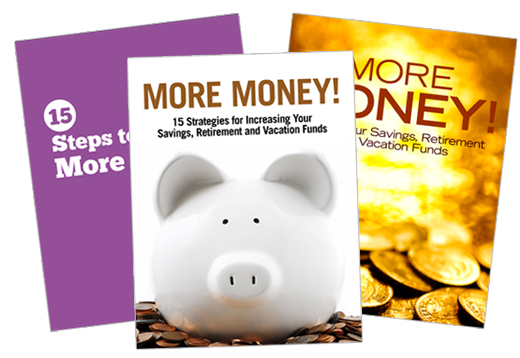
You audience’s first introduction to your e-book may be the 3-d version in the sidebar of your website. Take a minute and jot down any ideas you have about how this might look. If you already have an e-book promotion in your sidebar, take a look at it with fresh eyes. How does it make you feel? Is it enticing?
Second Glance
If they liked what they saw in your sidebar and clicked to download, within a few minutes your e-book will pop open on their screen. For an instant, at least, they will focus solely on your e-book cover. How do you want them to feel in that moment? If you already have an e-book, open it up. Take a look at the cover with fresh eyes. What is the cover saying about you and your business?
Lasting Impressions
You want a cover that is both verbally and visually powerful. A cover that matches your brand visuals and language. A cover that pulls your audience in. You want a cover that is 100 percent you. If it looks like every other e-book cover you’ve seen in the last year it’s time to do better.
3 Steps to Better E-book Covers
Whether you design your cover yourself or hire a designer to do it for you, these three steps are key.
1) Design for Impact
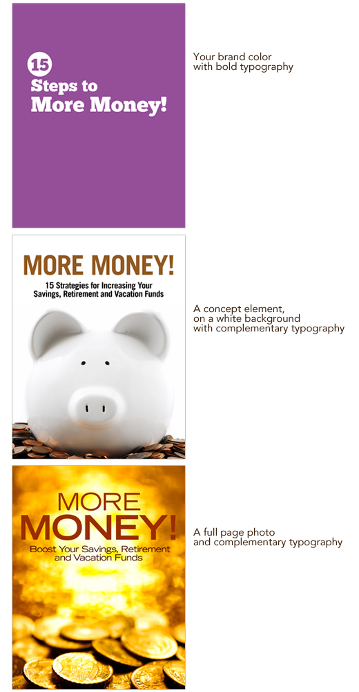
Design a cover that reinforces your brand visuals. This can be as simple as using your brand colors and typography, including your logo, or in the case of a series of e-books, using one consistent design element throughout the series.
Remember, your cover will be reduced to fit into your sidebar. Simple is better. Complex photos, thin fonts,and too much text will not translate at that small size. One quick way to check out how well your design translates to a smaller size is to view it at 25 percent and 50 percent.
Three simple DIY cover design options you can use.

2) Use Your Own Words
Chose a title reflects you and your brand. You can do this by starting to pay attention and notice your true voice. What phrases do you use all the time? What words light you up and also speak directly to your target audience? What can you pull out of the e-book to use as a title? Tip: Have someone else read your e-book out loud to you, listen for killer phrases that match up with your overall brand and the topic of the e-book.
E-book titles that showcase their author’s brands
Kris Carr – Crazy Sexy Manifesto
Jonathan Mead – Backpack
Danielle La Porte – Fire Starter Sessions
Tara Sophia Mohr – 10 Rules for Brilliant Women
3) Evaluate Honestly
Taking a few minutes to honestly evaluate your cover before it goes out in the world will put you miles ahead of your competition. Ask yourself these questions.
Does this cover reflect my brand?
If you look at your e-book alongside all your branding materials: logo, website, business card, etc. does it fit in? Will your audience know at a glance that this e-book is from you, or will they be left wondering who took over your company?
Is the cover simple and clear?
Will your audience know at one glance that it is for them? Does your title speak in your voice and convey the topic of your e-book clearly?
Is the cover fresh?
Does it look like every other e-book cover you’ve seen, or are you bringing your personality and branding to the table?
Am I proud to have my name on this cover?
If you answer “no” to any of those questions, remember that design is a process. Set the cover aside and come back to it in a few days. Then, take a fresh look at the cover and make note of the improvements you want to make. Make those changes and evaluate honestly again. Repeat as needed until you’re happy with the results.
Consumable Content
Think about all the content you consume in a day: emails, blog posts, YouTube videos, Facebook status updates, Tweets, webinars, online courses, calls, TV, radio, e-books, books, magazines, and more.
Content consumption
You are a content consumer and so are your ideal clients. As content consumers we often digest information better when it is delivered in chunks and sections.
Taste Tests
We like to snack, scan, skim, and jump into the content where it looks interesting. We look for entry points, indications of where to start, and clues about where to go next. For the most part this happens so automatically that we don’t even notice … unless those cues are missing.
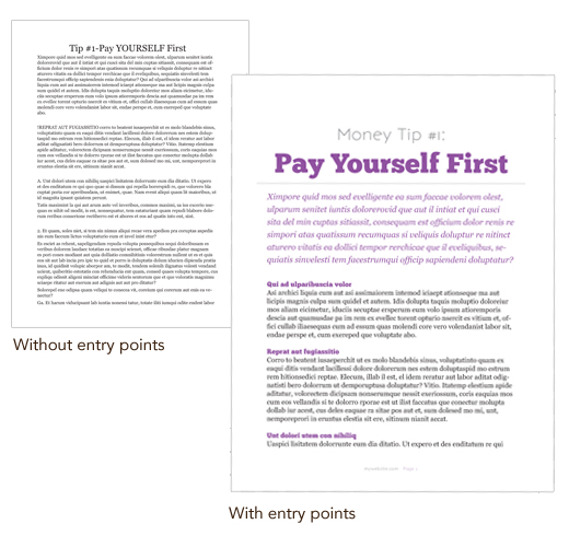
If those entry points are missing and we’re faced with a solid block of gray text, we get bored. Suddenly we’ve skipped through an entire blog post or e-book without processing anything and then we decide to head out to Facebook to find something tastier to snack on.
Content creation
Chances are, in the course of running your business today, you’ll switch roles and instead of consuming content you’ll be the creator. But before you hit publish, stop for just a few minutes and think about how you want your audience to experience your awesome content. Adding just a few tasty entry points will keep your audience moving smoothly through your content instead of snoozing.
See the difference?

Entry points
There are many different types of entry points that you can include, depending on what format your content takes. Here are some examples of entry points you could use in an e-book.
Entry points you can use in an e-book/PDF freebie:
chapters
sections
introductory paragraphs
headings
subheadings
pull quotes
lists
charts
photos/illustrations
photo captions
sidebars
calls to action
What entry points will you include in the content you create today?
I’ve used a few different entry points in this blog post. Headings (h1, h2, etc.), a list, an illustration, and, below, a call to action. If I’ve done my job well, you’ve dipped in at the entry points, read all the way to here, and learned something you can put into action today.
Planning Your Brilliant PDF Freebie
Freebies, Big Bananas, Pink Spoons…Got Yours?
Having a freebie, something awesome your website visitors can download or use for free, in exchange for signing up for your newsletter list, is key to growing your opt-in list and online business. If you don’t have one it’s time to get busy and get this done!
In interest of full disclosure, I’ll tell you that it took me f-o-r-e-v-e-r to finally get a downloadable freebie up on my site. Why? I’m so busy making big bananas for other lovely ladies that it is hard to find time to do my own stuff AND I was procrastinating like crazy.
Since I put my freebie up (see it over there on the right?) my list has grown 34 percent! So…do it!
Your freebie (also called a big banana or pink spoon) can take many forms: discount coupons, videos, audio lessons, courses, e-books, worksheets, downloadable PDFs, etc. Today we’ll be talking about PDF freebies.
Before you dive right in to creating your PDF freebie, stop for a few minutes and take a big picture view of the project. Doing this ground work that will set the foundation for creating a beautiful and useful PDF that will get downloaded and used (not downloaded and forgotten)!
The questions below will help you do this. They cover four key areas: audience, content, design/branding, and marketing.
Here we go. Grab a notebook and jot down your answers.
Audience
1. Who is this PDF for?
Picture someone reading your PDF and smiling and nodding and taking notes. Who is it?
2. How can you make this just for them?
What questions do they have that you can answer?
3. What step will they be able to take after reading your freebie? What will it help them do?
Why are they reading your PDF? What do they want to know, learn, or become from reading?
4. How do you want them to feel when they see/read your PDF?
Inspired, empowered, curious, entertained?
– – – – – – – – – – – – – – – –
Content
1. What is the topic of your pdf?
What are you going to write about my dear? Start with what your audience needs to know in order to hire you or buy your product.
2. What do you have to say about this topic that no one else does?
Now’s the time to differentiate yourself from everyone else. Say something new. Say something YOU.
3. What format is the content going to take?
-
Tips
Manifesto
Checklist
How To
Look Book
Product/Service Comparison
Process Explanantion
411 – Industry Jargon Explained
Workbook
E-book
4. Where is the content coming from?
Is this new content, a blog post you are expanding, old content that you are converting to a new format?
5. What ancillary info can you include to add more value to your content?
Will it include links to extra materials (videos/mp3/blog posts on your website)? Bonus resources/tips?
– – – – – – – – – – – – – – – –
Design/Branding
1. How do you want this freebie to look?
-
Heavily designed or basic?
Bold or understated?
Fun or serious?
Will it include photos or illustrations?
Will it include charts?
2. How are you going to maintain your current branding in the design?
What colors, fonts, and design elements from your website and other branding can you use to keep the look consistent?
3. How does this PDF fit into your business mission/goals?
Is it helping you expand into new areas, reinforcing your expertise in your niche?
4.
How does it fit in with the rest of your content/marketing materials.
Does this lead into a product or service you have? Is it an introductory piece for people who are new to your brand or something meatier for your loyal fans?
– – – – – – – – – – – – – – – –
Marketing
1. Why do you want to create this freebie?
Why you, why now? What makes this the right time to be creating this?
2. What results do you want?
Do you want more signups for your list, do you want to drive traffic to a sales page, etc?
3. How can you measure the results?
What’s your subscriber count now? Twitter followers, FaceBook fans? How are you going to keep track of the results this PDF brings?
4. What will success look like?
What increase/changes would make you ecstatic?
5. How can you take this up a notch and really make it a one-of-a-kind pdf that only you could create?
What skills, talents, background, unique perspective on the topic do you bring to the table?
6. How is this pdf going to be presented to your audience?
Opt-in, free, only to your list as premium content, as part of a product launch, as an add-on to an existing program/service, as a bonus for someone else program?
7. What kind of promo activities are you going to do to make sure your audience knows this resource is available to them?
Blog posts, guest posts, Tweets, status updates. Make a plan now to get this out in the world!
Woo! That’s a lot of questions!
– – – – – – – – – – – – – – – –
As you are writing, designing, producing your freebie your answers to these will help you keep the freebie focused and on track.
Come back to these answers if you get stuck while writing. Read through your first draft with these answers in mind. Use your answers as a checklist to align the intentions you have for the freebie with the final result.
You can use these planning questions to help you plan freebies in other formats, too.
– – – – – – – – – – – – – – – –
Want to learn how to write, design, produce your own PDF freebie?
Come learn how to write, design and promote an opt-in that’s perfect for your clients during Opt-in Brilliance. The next live session of the workshop starts September 23.
– – – – – – – – – – – – – – – –
Have an a-ha! moment while reading this post? Tell me about it in the comments.
– – – – – – – – – – – – – – – –