Ebooks
3 Ways to Improve Your PDF-style E-books
I’ve spent much of my time the last few months reviewing e-books, designing e-books, and teaching a workshop on how to create PDF-style e-books. I’ve been blown away by the depth of knowledge being shared by entrepreneurial women around the world. We are so generous with our knowledge.
I want all that knowledge that you’re sharing to have the biggest impact possible on your audience and bottom line. So, I wanted to share with you three areas in the e-book creation process where everyone could do little bit of tweaking: cover design, brand consistency, and content balance.
The next time you create an e-book do these three things:
#1: Spend more time on your cover
Your audience will judge your PDF-style e-book by its cover (even if you are giving it away for free as an opt-in). They will decide, based on how it looks, and what it says, if it’s right for them.
Do This:
Always create more than one cover option. Play around with different photos, illustrations, typography, colors, and titles.
Print these out and post them on your bulletin board for a few days. See which covers repeatedly draw your attention. Notice which titles roll off your tongue easily and stick in your head.
Put yourself in your ideal client’s shoes and think about how you want them to feel when they first see your cover.
Take your favorite cover options and do another round of tweaks. Repeat this process until your cover shines.
For more information on cover design read Judging Your E-book By Its Cover.
– – – – – – – – – – – – – – – –
#2: Stay on brand
Use the brand you already have to design your cover and interior pages.
You might think this is boring, but being consistent with your brand visuals, from your website to your e-book and beyond, increases brand recognition. This is a good thing, just ask Nike.
Do This:
Use your brand colors and typography throughout your e-book. Include your logo and any other design elements that you use on your website.
If you don’t know your brand colors and fonts, check with whomever designed your logo and/or website to get those. This is important information that you need to have on hand.
Examples of awesome e-books with consistent branding:
Mayi Carles: 5K Sales in 365 Days
Jessica Ainscough: Make Peace With Your Plate
Mindy Crary: Getting Started with Conscious Spending
– – – – – – – – – – – – – – – –
#3: Stop over-sharing
I’m sure you’ve read e-books where the first 10 pages are a mini-biography of the author’s life and you’re skipping through to get to the secret that was supposed to be revealed. Don’t be that person. Save your entire life story for your auto biography.
Your e-book is not about you! Your e-book should be helping your ideal client solve their problem.
Do This:
Put yourself in your ideal clients shoes and read your e-book like you don’t know yourself. Honestly evaluate how much of the e-book is about you and how much is devoted to solving your client’s problems. Read this post if you need help planning content for your e-book or freebie.
Tip the content balance in favor of your ideal clients: delete over-sharing. You can always add a link to your website “about me” page and invite your readers to visit your site to learn more about you.
One last tip for you under-sharers: You can’t help your ideal client solve their problem if you don’t give them some kind of action to take, or a way to contact you after they’ve read your e-book. Make sure to include your contact information in your e-book. You’d be surprised how many e-books don’t include this information.
Have an a-ha! moment while reading this post? Tell me about it in the comments.
– – – – – – – – – – – – – – – –
Judging Your E-book By Its Cover
Your audience will judge your PDF-style e-book by its cover (even if you are giving it away for free as an opt-in). They will decide, based on how it looks and what it says, if it’s right for them.
How do you want your audience to feel when they see your e-book for the first time? How do you want to present yourself?
Seeing Your E-book Through Their Eyes

First Look
You audience’s first introduction to your e-book may be the 3-d version in the sidebar of your website. Take a minute and jot down any ideas you have about how this might look. If you already have an e-book promotion in your sidebar, take a look at it with fresh eyes. How does it make you feel? Is it enticing?
Second Glance
If they liked what they saw in your sidebar and clicked to download, within a few minutes your e-book will pop open on their screen. For an instant, at least, they will focus solely on your e-book cover. How do you want them to feel in that moment? If you already have an e-book, open it up. Take a look at the cover with fresh eyes. What is the cover saying about you and your business?
Lasting Impressions
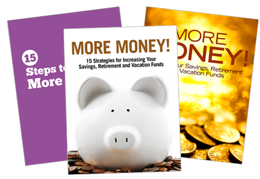
You want a cover that is both verbally and visually powerful. A cover that matches your brand visuals and language. A cover that pulls your audience in. You want a cover that is 100 percent you. If it looks like every other e-book cover you’ve seen in the last year it’s time to do better.
3 Steps to Better E-book Covers
Whether you design your cover yourself or hire a designer to do it for you, these three steps are key.
1) Design for Impact
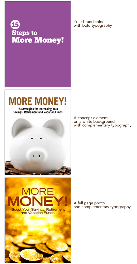
Design a cover that reinforces your brand visuals. This can be as simple as using your brand colors and typography, including your logo, or in the case of a series of e-books, using one consistent design element throughout the series.
Remember, your cover will be reduced to fit into your sidebar. Simple is better. Complex photos, thin fonts,and too much text will not translate at that small size. One quick way to check out how well your design translates to a smaller size is to view it at 25 percent and 50 percent.
Three simple DIY cover design options you can use.

2) Use Your Own Words
Chose a title reflects you and your brand. You can do this by starting to pay attention and notice your true voice. What phrases do you use all the time? What words light you up and also speak directly to your target audience? What can you pull out of the e-book to use as a title? Tip: Have someone else read your e-book out loud to you, listen for killer phrases that match up with your overall brand and the topic of the e-book.
E-book titles that showcase their author’s brands
Kris Carr – Crazy Sexy Manifesto
Jonathan Mead – Backpack
Danielle La Porte – Fire Starter Sessions
Tara Sophia Mohr – 10 Rules for Brilliant Women
3) Evaluate Honestly
Taking a few minutes to honestly evaluate your cover before it goes out in the world will put you miles ahead of your competition. Ask yourself these questions.
Does this cover reflect my brand?
If you look at your e-book alongside all your branding materials: logo, website, business card, etc. does it fit in? Will your audience know at a glance that this e-book is from you, or will they be left wondering who took over your company?
Is the cover simple and clear?
Will your audience know at one glance that it is for them? Does your title speak in your voice and convey the topic of your e-book clearly?
Is the cover fresh?
Does it look like every other e-book cover you’ve seen, or are you bringing your personality and branding to the table?
Am I proud to have my name on this cover?
If you answer “no” to any of those questions, remember that design is a process. Set the cover aside and come back to it in a few days. Then, take a fresh look at the cover and make note of the improvements you want to make. Make those changes and evaluate honestly again. Repeat as needed until you’re happy with the results.
Consumable Content
Think about all the content you consume in a day: emails, blog posts, YouTube videos, Facebook status updates, Tweets, webinars, online courses, calls, TV, radio, e-books, books, magazines, and more.
Content consumption
You are a content consumer and so are your ideal clients. As content consumers we often digest information better when it is delivered in chunks and sections.
Taste Tests
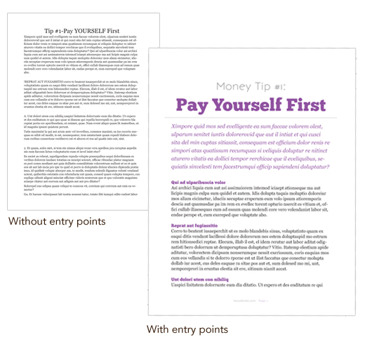
We like to snack, scan, skim, and jump into the content where it looks interesting. We look for entry points, indications of where to start, and clues about where to go next. For the most part this happens so automatically that we don’t even notice … unless those cues are missing.
If those entry points are missing and we’re faced with a solid block of gray text, we get bored. Suddenly we’ve skipped through an entire blog post or e-book without processing anything and then we decide to head out to Facebook to find something tastier to snack on.
Content creation
Chances are, in the course of running your business today, you’ll switch roles and instead of consuming content you’ll be the creator. But before you hit publish, stop for just a few minutes and think about how you want your audience to experience your awesome content. Adding just a few tasty entry points will keep your audience moving smoothly through your content instead of snoozing.
See the difference?

Entry points
There are many different types of entry points that you can include, depending on what format your content takes. Here are some examples of entry points you could use in an e-book.
Entry points you can use in an e-book/PDF freebie:
chapters
sections
introductory paragraphs
headings
subheadings
pull quotes
lists
charts
photos/illustrations
photo captions
sidebars
calls to action
What entry points will you include in the content you create today?
I’ve used a few different entry points in this blog post. Headings (h1, h2, etc.), a list, an illustration, and, below, a call to action. If I’ve done my job well, you’ve dipped in at the entry points, read all the way to here, and learned something you can put into action today.