3 Steps to Beautiful and Useful Interior Pages in Opt-in PDFs, E-books, and Other Publications
Staring at words on the screen and trying to figure out how to design them so they look as good as they do in your mind can be overwhelming and frustrating. Even veteran designers get creative blocks when faced with a page full of text.
I use these 3 steps to break through creative blocks to design interior pages that are both useful and beautiful. Give these tips a try when you’re facing page design dilemma.
#1: Sketch It Out
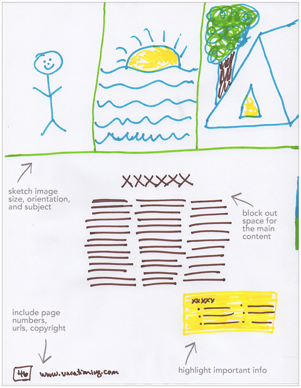
When you put pen to paper it frees up serious brain power. Just drawing out where you want the different elements of content on the page (before you even open up a software program) will make your interior pages come together more quickly. You’ll be able to clearly see what kind of design elements and specific pieces of content you need to pull it all together in a nice package.

TIP: Colored markers make it fun! Also, do more than one sketch, to see how all the elements could fit together. Then scan your favorite sketch, place it in our document, and design over the top of it.
#2: Get inspired
It’s not where you take things from—it’s where you take them to. ~ Jean-Luc Godard
Start, and keep adding to, an inspiration file just for document design. Make a Pinterest board or start a folder on your computer. Collect examples of pdfs, opt-ins, magazines, flyers, catalogs, etc. that strike your fancy.
When you’re designing your own documents, you can go back through your inspiration file, soak it in, and follow the creative sparks that come.
TIP: Look for inspiration on Pinterest, Behance, Designspiration, search for book design, magazine design, brochure design, flyers, etc.
#3 Follow a formula
There’s no need to reinvent the world of document and publication design each time you start a new project. Examining how other documents are put together will help you write and structure your content, and decide what design elements you need.
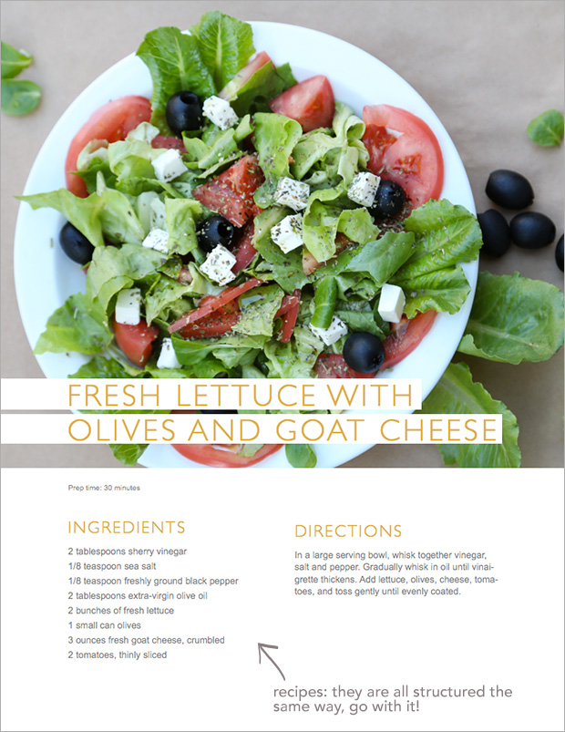
If you’re designing a recipe, look at how other recipes are structured in cook books and magazines. If you’re designing a fashion layout, look at how that’s done in your favorite magazine.

TIP: Keep it simple, deconstruct the elements that make up the content and design and use that formula to guide your own design project. For the recipe page above there are only 5 elements: a photo, recipe name, list of ingredients, directions, and prep time.
p.s. Feel free to laugh at my fancy drawing skills!
This is a head slap moment! Trying to create on my computer with canva, etc is a challenge (for this total novice) and you just made me realize one of the biggest pieces of the challenge. You just took it old school – why didn’t I think of that?! 😉 Whipping out my colored pencils…great post!