Brand and Be Seen: Family Law Firm
Brand and Be Seen is a series of blog posts offering brand style guides for fictional brands to inspire you to create your own beautiful brand. Feel free to use the font combinations and color palettes as you wish. Happy branding!

About the Brand
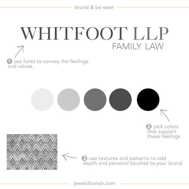
Whitfoot LLP is a law firm that helps families with estate planning. Many of their clients are making these decisions because they are older and wanting to get their estates settled before they start experiencing major health issues.
They want their customers to know that they understands their concerns about keeping as much of their estates intact as possible. They want their clients to feel confidence, competency, and wealth radiating from their branding.
They are a very traditional company. Their choice of gray tones for brand colors and very traditional looking fonts is a nod to the seriousness of the topics they help their client with and the care they take in handling these issues for their clients.
Details:
Logo: Caslon 540
Tagline: Univers Light
Colors: #e7e7e7, #5e5e5e, #3a3a3a, #000000
Texture: Photoshop vintage patterns, search for “vintage patterns Photoshop” on Creative Market (affiliate link).
Learn how to choose fonts and colors to best tell your brand story and build a website to match in The Brand Workshop or work one-on-one with Christie Halmick of Jewels Branch to brand your business and website.
I love these brand and be seen segments. You break it down perfectly. It awesome to see the why behind another designers brain. We spend so much time designing, behind our laptops that we often don’t get to chit chat with our fellow creatives.
Thank you so much Torie. I love doing these and have many more planned. It always wonderful to talk to other designers.
Always so interesting to see the details and thoughts that hide behind a logo and a design. Thanks for sharing, Christie!
Gorgeous brand design! I love the simplicity of both the design and the colors. I love that everything has a purpose and a meaning. It keeps me thinking about the feeling and meanings I want to convey on my website.
Christie this is broken down so simply! I really need to do this. Thanks!
This is fun. Pretend branding is always fun…and guaranteed not to have Uncle Ralph’s favorite color needing to be incorporated. I am looking at this thinking how their front office needs to be designed. I get trust, professionalism, expertise and traditional from these choices. Besides that, it is beautiful. Thanks!
The Hypothetical Client – fun! Even this idea gives insight into the depth of your creativity. Thank you!
This was like a video game. Piecing things together digitally to “win” at branding. I enjoy this way of deciding what would fit and work within my personal brand as well as being able to support others in what might be awesome for them. Thank you!
Girl, your stuff is always so useful. It’s fascinating how you broke this down so we can see why each element was chosen.