Brand and Be Seen: Digital Strategist
Brand and Be Seen is a series of blog posts offering brand style guides for fictional brands to inspire you to create your own beautiful brand. Feel free to use the font combinations and color palettes as you wish. Happy branding!
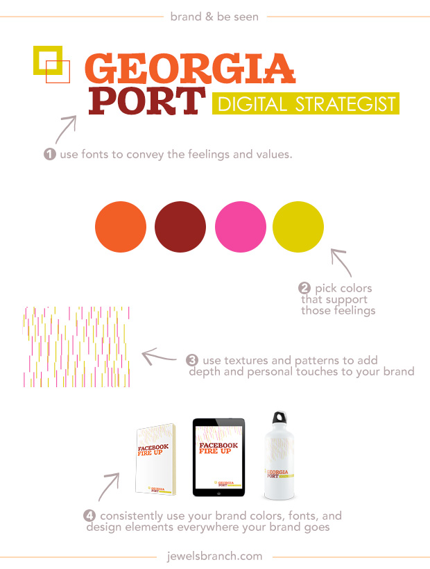
About the Brand
Georgia Port helps brick and mortar businesses manage their social media profiles. Many of her clients are overwhelmed by the decisions they need to make to take advantage of social media and want an expert to handle their profiles for them.
Georgia wants her customers to know that she has serious tech chops and marketing strategy skills. She loves to break down social media jargon into easy to understand pieces and takes a custom approach to crafting social media plans for her clients.
Georgia loves bright colors. She believes social media can be fun and profitable for her clients. She wants her branding to reflect the fun she has coming up with social media strategies for her clients.
Details:
Logo: Zantroke
Tagline: Century Gothic
Colors: #ec471e, #821518, #ed298f, #d8c600
Texture: Photoshop shapes, search for “pixel backgrounds” on Creative Market (affiliate link).
Learn how to choose fonts and colors to best tell your brand story and build a website to match in The Brand Workshop or work one-on-one with Christie Halmick of Jewels Branch to brand your business and website.
Thanks for a great reminder of how our branding should be a reflection of us. Love these bright colours.
You know me…I see these fonts and colors…and I think voila…the perfect colors for me! What a great representation of your point. You have a special talent of mixing the grounded colors with the flamboyant colors. While the colors are fun to put together. I feel it is good to really celebrate fonts individually. You wonder – with all the gorgeous fonts in the world – how everyone gravitates toward the same ones. Thanks!