Does Your Website Header Need a Facelift?
Take a good look at your website header – your site’s conversation starter.
Does it look professional? Does it clearly say what service or product you offer? Does it entice your visitors to explore your site?
These questions are fresh in my mind because I’ve spent a lot of time the last few months designing headers for my clients. I love the process because I know that I can quickly and cost effectively make a difference in their businesses just by designing a powerful header for their website.
Here’s a step-by-step look at my header design process.
Step 1: Q & A
The process starts with a design and content questionnaire. This helps me understand you, your business, your ideal customers and your design style. It gives us a place to gather all the technical information I’ll need to make sure your header fits the space available on your site and matches any existing branding you have.
Next, we get on the phone or Skype and talk about your business. This is one of my favorite parts of the process because I get to put on my journalist’s hat and ask you questions like: Why did you start your business? and What do your clients experience when they do business with you? I get to peek inside your brain and see your business through your eyes.
Step 2: Design
Here’s where my design and marketing knowledge is put to use translating all you’ve told me about your business into something beautiful that can help your business grow.
If I’m creating a logo treatment for you, as part of the header design, I start by experimenting with typography. I focus on fonts for about an hour, or so. At this point I’m working in Illustrator. I end up with a page full of your business name in many different fonts and then narrow these down to five or six of my favorites to play with more.
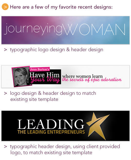
Often header design involves pulling together your logo, photo, and tagline into a cohesive unit that matches existing aspects of your branding or website template. Sometimes illustration is involved, other times I use stock photography to tie it all together. At this point in the process, I’m working in Photoshop. After I have a few header options that I think are awesome, I test them out on a screen shot of your site or template. Then I tweak, test, tweak, test until I’m happy with the results.
Step 3: Review & Revise
When I’m satisfied I’ve created the best header options for you, I send you a PDF of the options for review and we go through the revision process.
Step 4: Approval & Launch
Once you’ve approved the header design, I get the final file (usually a jpeg or gif) over to you ASAP so you can load it on your site and smile about the results.
When your site looks great, you feel great about your business. It’s an instant facelift for your site and your confidence.
There’s no reason not to have an awesome header that features the personality of your business and attracts your potential customers and clients. If you like my work, feel free to get in touch. I’d love to work with you.
