3 Sites for Color Scheme Exploration
As you’re developing all the elements of your visual brands you can start with one main brand color (mine is orange) and then expand out from that color to create a larger scheme or palette. If you’re still looking for that one main color go here for some inspiration.
You can use basic color theory (stuff you learned in high school art): color categories (warm, primary, secondary, cool, etc.), common color schemes (like complementary, analogous, triad), and shades/hues (adding white, black, and gray to that main color), to create these color palettes.
In my site redesign, for the launch of the new Jewels Branch Creative Community, I wanted to add a wider range of colors to my palette and freshen things up a bit. So I turned to the following color scheming sites to help me quickly add some new colors to my palette that would match my main brand color.
Color Scheming
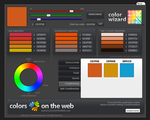
1) Color Wizard
You can see my primary color, orange #CD5928, and “complementary” colors that I could use in my brand color palette.
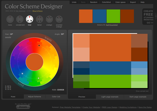
2) Color Scheme Designer
You can see my primary color, orange, and the “triad” colors that I could use in my brand color palette.
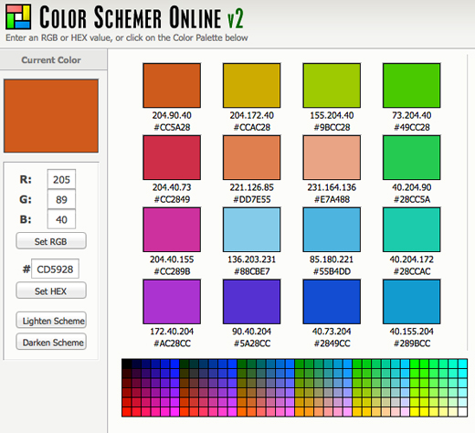
3) Color Schemer Online

You can see my primary color, orange, and many color choices that I could use in my brand color palette. Color Schemer lets you lighten and darken the scheme, too.
Give these sites a try and expand your brand color palette!
P.S. If you get all excited about color palettes, that’s a sign that your inner graphic designer is yearning to be set free. Come join the creative community and give that gal her wings. Early bird specials are good through May 1.


I can see how those sites would be really helpful. And I LOVE orange!! 🙂
Thanks!
Thanks for sharing these sites! When it is time to expand my website, I can see how these might be really useful.
You’re welcome Belinda!
Oh, goody! More colour picking sites! Wheeeee!!! I’ve been using the Color Scheme Designer for a couple of years now – I didn’t even know about the other ones! Thank you!
Hugs and butterflies, ~Teresa~
Thanks for the resources! I’m always looking for new ideas!
Just a reminder. A site’s colors need to not only be visually appealing, they also need to work to draw the eye of the visitor to the things that you want them to do on the site. Using one primary color strongly and then using the accent color to draw that attention is a great way to do that. (Of course good graphic design helps too.)
Christie, thanks for the helpful resources.
My web site and logo are in the teal, purple range. However, if I ever change that up, I would turn to a graphic designer for assistance, but these resources will certainly come in handy as well.
Thanks.
~Debra
WOW! A whole world of possibilities…thank you so much! It’s amazing what comes up when you decide on just one color, and the work from there–a lot of combos that you would never imagine look good. Great websites to check out!! 🙂
Thanks for such great resources for color palettes. Until I entered the world of websites I just came up with all that stuff on my own. It’s nice to enter the world of a designer and get some inside tips on the “right” way to match colors. ♥
Super helpful sites Christie. I could get lost for hours playing with all the color!
Thanks for such a great resource.
Very helpful sites! I love color palettes and I’m prone to orange + purple so I’ve stuck with that for my “brand.” I always enjoy your insider tips.
FUN! Thanks to your tips (and our awesome phone call the other day — thank you!!!), I have a new color scheme for my soon-to-be-new-and-improved website! YAAAAAAY!
This is so helpful. Bookmarking them for sure!