Brand and Be Seen: Jewelry Maker
Brand and Be Seen is a series of blog posts offering brand style guides for fictional brands to inspire you to create your own beautiful brand. Feel free to use the font combinations and color palettes as you wish. Happy branding!
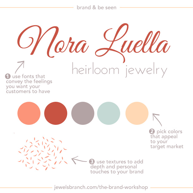
About the Brand
Nora Luella creates custom heirloom jewelry. The kind of jewelry that mothers buy for their daughters to mark special occasions in their lives.
Nora wants her customers to know that she understands their desire to document and honor their connection with their daughters. She wants them to feel warmth radiating off her branding.
She’s infused her own personality into her branding. Her brand colors remind her of grandmother’s favorite bracelet and the texture she’s chosen reminds her of the leaves falling from her favorite childhood tree.
Details:
Logo: Great Vibes
Tagline: Josefin Sans
Colors: #f87f66, #ba3e34, #a49294, #b7d1ca, #fecfa5
Texture: Photoshop custom shape
Learn how to choose fonts and colors to best tell your brand story and build a website to match in The Brand Workshop or work one-on-one with Christie Halmick of Jewels Branch to brand your business and website.
Like the font and the soft colors.
Nice job.
🙂
The branding workshop looks informative and it is something I need to understand a bit better, but really can not afford it right now. Love the great vibes font…I’ve been using it a lot lately on my daily fan page posts! 🙂
Beautiful fonts and colors! Which reminds me I probably should have good look at my own branding soon 🙂 Thanks for the inspiration!
Love this!
I actually use the Great Vibes Font! I just love all colors of the rainbow. Due to my serious business topic I like to bring fun and entertainment to my brand by using bright fun colors.
Telling a story about why one would be inspired to use a particular color or font is key to branding. People visiting your website can get a first impression of who you are right away.
Great tip! Yes, fonts and colors definitely set the mood and it’s something people have to pay attention to when starting a business. You have to set the right tone and vibe for sure!
This really caught my eye. Great breakdown of where to start with branding. I’ve shared with a client who has just sent me her new logo today. I’m sure it will have her thinking towards the future in branding.
So happy to be taking the workshop to learn more. I’ve been all over the place for years and am ready to get a solid brand.
Finding the right font and colour can be a rabbit hole on time. As you highlight it is so important to take that time to convey the right image and message. Cx
Nice outline! I’, happy to replicate it in developing my own brand. I love the way this structure gives an overall impression of what the brand looks like and what it stands for.
The big takeaway I got from this was the contrast between the logo and the tagline, keeping it a different style.
By the way, I LOVE Brand and Be Seen! What a great concept for a series! 😀 I’m looking forward to seeing the future posts and the fictional brands you’ll introduce us to 😉
I’ve been in the process of rebranding my website, so it’s really interesting to me to see this behind the scenes look at branding. Beautiful work and very helpful! Thanks!