brand and be seen
Brand and Be Seen: Digital Strategist
Brand and Be Seen is a series of blog posts offering brand style guides for fictional brands to inspire you to create your own beautiful brand. Feel free to use the font combinations and color palettes as you wish. Happy branding!

About the Brand
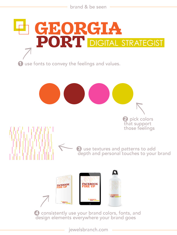
Georgia Port helps brick and mortar businesses manage their social media profiles. Many of her clients are overwhelmed by the decisions they need to make to take advantage of social media and want an expert to handle their profiles for them.
Georgia wants her customers to know that she has serious tech chops and marketing strategy skills. She loves to break down social media jargon into easy to understand pieces and takes a custom approach to crafting social media plans for her clients.
Georgia loves bright colors. She believes social media can be fun and profitable for her clients. She wants her branding to reflect the fun she has coming up with social media strategies for her clients.
Details:
Logo: Zantroke
Tagline: Century Gothic
Colors: #ec471e, #821518, #ed298f, #d8c600
Texture: Photoshop shapes, search for “pixel backgrounds” on Creative Market (affiliate link).
Learn how to choose fonts and colors to best tell your brand story and build a website to match in The Brand Workshop or work one-on-one with Christie Halmick of Jewels Branch to brand your business and website.
Brand and Be Seen: Family Law Firm
Brand and Be Seen is a series of blog posts offering brand style guides for fictional brands to inspire you to create your own beautiful brand. Feel free to use the font combinations and color palettes as you wish. Happy branding!

About the Brand
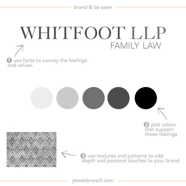
Whitfoot LLP is a law firm that helps families with estate planning. Many of their clients are making these decisions because they are older and wanting to get their estates settled before they start experiencing major health issues.
They want their customers to know that they understands their concerns about keeping as much of their estates intact as possible. They want their clients to feel confidence, competency, and wealth radiating from their branding.
They are a very traditional company. Their choice of gray tones for brand colors and very traditional looking fonts is a nod to the seriousness of the topics they help their client with and the care they take in handling these issues for their clients.
Details:
Logo: Caslon 540
Tagline: Univers Light
Colors: #e7e7e7, #5e5e5e, #3a3a3a, #000000
Texture: Photoshop vintage patterns, search for “vintage patterns Photoshop” on Creative Market (affiliate link).
Learn how to choose fonts and colors to best tell your brand story and build a website to match in The Brand Workshop or work one-on-one with Christie Halmick of Jewels Branch to brand your business and website.
Brand and Be Seen: Jewelry Maker
Brand and Be Seen is a series of blog posts offering brand style guides for fictional brands to inspire you to create your own beautiful brand. Feel free to use the font combinations and color palettes as you wish. Happy branding!

About the Brand
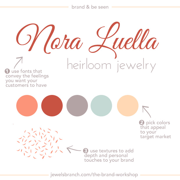
Nora Luella creates custom heirloom jewelry. The kind of jewelry that mothers buy for their daughters to mark special occasions in their lives.
Nora wants her customers to know that she understands their desire to document and honor their connection with their daughters. She wants them to feel warmth radiating off her branding.
She’s infused her own personality into her branding. Her brand colors remind her of grandmother’s favorite bracelet and the texture she’s chosen reminds her of the leaves falling from her favorite childhood tree.
Details:
Logo: Great Vibes
Tagline: Josefin Sans
Colors: #f87f66, #ba3e34, #a49294, #b7d1ca, #fecfa5
Texture: Photoshop custom shape
Learn how to choose fonts and colors to best tell your brand story and build a website to match in The Brand Workshop or work one-on-one with Christie Halmick of Jewels Branch to brand your business and website.