How Visualization & Dreaming Influence Design
Case Study: Shine Creative Wellness
This is easily one of my favorite projects of the past year because the process of working with this client was just lovely.
I got to sit down with my client face-to-face and listen as she described her plans for her business in awesome detail. Then, we worked side-by-side (literally she was sitting right next to me in my office) to make that vision a reality in her branding.
Since she is a very artistic and visual person, she wanted to create a bit of her brand presence to provide inspiration while working through all the bureaucratic details of starting her business.
Prior to meeting with me, she’d spent time visualizing her wellness practice. She knew her business would be called Shine Creative Wellness. She described the type of clients she wants to serve, the colors of paint on the walls, the way the receptionist would greet clients, the smell of clary sage and the sound of the door chime. She talked about brightness, balance, connection, sunflowers, joy, royalty, growth, and simplicity.
As she was describing her business to me I could see the space coming together in my mind and feel the softness and care that would surround anyone who entered.
Because she had already put so much thought into her brand, we had a solid foundation to build upon in creating her logo and brochure.
Logo Design:
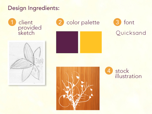
To create the logo, I scanned a sketch she had drawn of sunflower petals, then traced, refined and colorized the petals in Illustrator.
We tried several different font combinations and settled on Quicksand because it felt modern, open, clean and simple.
The color palette reflected the recurring sunflower theme with bright yellow and rich, lush purple.
Brochure Design:
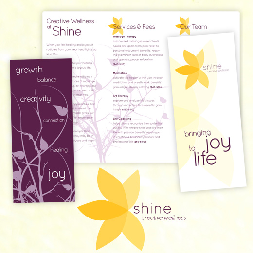
I chose a stock illustration to emphasize growth and add some texture and depth to the basic tri-fold layout. I customized the illustration in Illustrator by removing the original background and adjusting the colors. We tweaked the copy she had written to make it easy to navigate and read, then added it to the InDesign layout.
Here are the results:

My client dreamed for her businesses. She visualized the future. Her dreams, her visions for her business and her willingness to share them with me all contributed to the creation of a logo that shines.
What are you dreaming of for your business? Please share in the comments or send me a tweet. @jewelsbranch

Christie,
This is just great stuff—-process is so interesting to read/talk about. Thanks for sharing.
The purple and yellow are so gorgeous together, and exude a sense of freshness with depth.
I’ll have to pick your brain about other design questions I have soon.
Best,
~Liz