Archive for March 2011
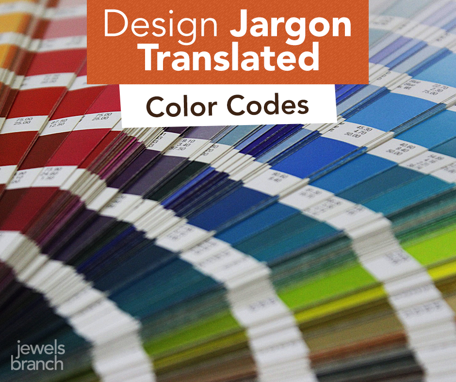
Design Jargon Translated – Color
Do your eyes glaze over when you hear your designer talking geek?
Are you afraid to ask what the heck they mean?
You certainly don’t need to understand every detail of a designer’s job (they are the expert you are hiring, after all). But you shouldn’t sit around feeling intimidated, either.
A basic understanding of all the jargon being thrown your way will help improve communication between you and your designer.
Here are a few tips about color to help you converse confidently with your designer.
To start us off we’ll be talking about what true red looks like. Don’t be afraid, it’s easy!
Your designer says: CMYK
They are talking about: C (cyan) M (magenta) Y (yellow) K (key/black). Inks used in traditional 4-color printing.
To a designer red in CMYK looks like: 0c, 91m, 76y, 6k
Real life examples: business cards, logos, brochures, magazines, catalogs.
Your designer says: RGB
They are talking about: R (red) G (green) B (blue). Light used to show color on electronic devices.
To a designer red in RGB looks like: 224, 58, 62
Real life examples: iPhones, iPads, computer monitors, TVs, digital cameras.
Your designer says: Pantone
They are talking about: special single color inks used in printing, often called spot colors.
To a designer red in Pantone looks like: Pantone 186
Real life examples: logos, business cards, stationary, annual reports where companies want to ensure their branding stays true to color.
Your designer says: hex number
They are talking about: the code used to tell your browser what color to display.
To a designer red in a hex# looks like: #e03a3e
Real life examples: web pages displayed on your computer monitor.
Still confused about color? Shoot me an email. I’ll answer.
Come back next Monday and I’ll translate more design jargon just for you.
The First Taste of Summer
Our living room is a miniature greenhouse.
Rows of plant pots are lined up by the windows to catch the sun.
The girls make a routine of checking the pots every morning and afternoon. So far nothing, no peppers, no broccoli, no petunias.
But yesterday after school Adia came running into my office with a huge grin on her face.
“The broccoli’s sprouted! Come and see!” she yelled.
Her sister, Loren, and Jamie and I went to look. There they were, tiny green shoots with lobed leaves at the top. Sometime between 8 a.m. and 3 p.m., when no one was watching, the broccoli emerged.

At my house, spring gets us out of our winter pity party. It gets us off the computer and out into the garden. It gives us a purpose.
In those little broccoli sprouts we see a course of action plotted out with a tasty end result. We’ll transplant, we’ll water, we’ll weed, we’ll keep the rabbits out of the garden.
Magic will happen when we’re not even watching.
Suddenly the broccoli will have a head that wasn’t there the day before. A ripe tomato will appear and we’ll share that first taste of summer.
Does Your Website Header Need a Facelift?
Take a good look at your website header – your site’s conversation starter.
Does it look professional? Does it clearly say what service or product you offer? Does it entice your visitors to explore your site?
These questions are fresh in my mind because I’ve spent a lot of time the last few months designing headers for my clients. I love the process because I know that I can quickly and cost effectively make a difference in their businesses just by designing a powerful header for their website.

Here’s a step-by-step look at my header design process.
Step 1: Q & A
The process starts with a design and content questionnaire. This helps me understand you, your business, your ideal customers and your design style. It gives us a place to gather all the technical information I’ll need to make sure your header fits the space available on your site and matches any existing branding you have.
Next, we get on the phone or Skype and talk about your business. This is one of my favorite parts of the process because I get to put on my journalist’s hat and ask you questions like: Why did you start your business? and What do your clients experience when they do business with you? I get to peek inside your brain and see your business through your eyes.
Step 2: Design
Here’s where my design and marketing knowledge is put to use translating all you’ve told me about your business into something beautiful that can help your business grow.
If I’m creating a logo treatment for you, as part of the header design, I start by experimenting with typography. I focus on fonts for about an hour, or so. At this point I’m working in Illustrator. I end up with a page full of your business name in many different fonts and then narrow these down to five or six of my favorites to play with more.
Often header design involves pulling together your logo, photo, and tagline into a cohesive unit that matches existing aspects of your branding or website template. Sometimes illustration is involved, other times I use stock photography to tie it all together. At this point in the process, I’m working in Photoshop. After I have a few header options that I think are awesome, I test them out on a screen shot of your site or template. Then I tweak, test, tweak, test until I’m happy with the results.
Step 3: Review & Revise
When I’m satisfied I’ve created the best header options for you, I send you a PDF of the options for review and we go through the revision process.
Step 4: Approval & Launch
Once you’ve approved the header design, I get the final file (usually a jpeg or gif) over to you ASAP so you can load it on your site and smile about the results.
When your site looks great, you feel great about your business. It’s an instant facelift for your site and your confidence.
There’s no reason not to have an awesome header that features the personality of your business and attracts your potential customers and clients. If you like my work, feel free to get in touch. I’d love to work with you.