Graphic Design
Lessons from my first month of full-time blogging
In February I decided to challenge myself to blog every weekday in March.
No excuses. I had to post every weekday.
I did this to get myself unstuck and over my fear of blogging. Today I’ve accomplished my goal!
The first week was torture. I second guessed myself at every turn. Hated my editorial calendar. Wanted to quit.
But I didn’t quit. Here are a few reasons why:
1> I found accountability partners.
I announced my goal to two people who would help keep me accountable, my husband, Jamie and my good friend, Jenn Morgan. We didn’t have any formal agreement for them to check up on me. But I did not want to come back to them today and say that I hadn’t finished my goal. I did not want to let them, or myself, down.
2> I gave blogging “important” status.
I started treating my blogging project with the same emphasis and attention that I give to my client work. My client work gets done. Period. No excuses. On time. I gave blogging equal weight in my list of priorities. At the end of February, I blocked out time on my schedule everyday for writing blog posts.
3> I made it fun.
I spent time crafting posts, selecting fonts, editing photos, thinking up funny titles. All the stuff that I like to do. I made it a creative endeavor instead of a chore to check off.
4> I made an editorial calendar.
I like to write whatever is on my mind each day. But on those days when the muse doesn’t show up, the editorial calendar was key to getting something posted.
5> I gave myself permission to be a writer.
I started to accept how much I love to write and to embrace that part of me. Writing this month gave me the push I needed to sign up for a writing conference.
Here’s a roundup of my posts for March. I hope you find something here to inspire you to think about design and writing as a tool to tell your business’s story
March Blog Post Roundup
Talking About Design
- Why I Love What I Do
- What Can a Graphic Designer Do for your Business
- Confidence and Your Website
- Do online businesses need a logo?
- Does Your Website Header Need a Facelift?
- Design Jargon Translated – Color
- Design Jargon Translated – Vectors
I Love Fonts And So Can You
- 4 Flowy, Flirty, Feminine & Free Fonts
- Good Fonts Gone Bad
- The Skinny on Thin Fonts
- Fun and Sensible Fonts
- We’re Here for the Party Fonts
Look Ma, I’m a Writer
Taking Care of Business
Life in Photos
Life in Words
Thanks for reading!
Shush Up!
This week two articles with different takes a similar theme caught my eye. Both explore the idea of knowing when to shut up! (or shush up, as my Grandma Marie would say).
Even the introvert in me, who spends quite a bit of time shushed up, wanted to give these posts a shout out.
First up, Peter Shankman, who says that you can make a big impression by paying attention and shutting up.
“Listen to what someone says and make notes about key points. Asking about those key points later, or following up on them, separates you from the rest of the people we talk to on a daily basis.” -Peter Shankman, Five Things People Don’t Do – That You Should
Amen. Paying attention to what my clients say and don’t say is vital to creating content and designs that work for their businesses and audiences. Giving my clients quiet time and space to think through and answer my question about their business means we both come out of our calls with crystal clear goals.
Christopher S. Penn of Awaken Your Superhero, gives a great suggestion on how to slow down your motor mouth: identify your own personal earworm to help you learn The Most Powerful Sales Technique in the World (Shut Up!).
“One of our failures as content generators, as content creators is the mistaken belief that we need to be providing speech as content all the time to keep a prospect engaged. Nothing could be further from the truth, but constant content seem like something we should be doing because of our online culture.” -Christopher S. Penn
Penn’s earworm pick is the hilarious On the Rocks – University of Oregon’s a cappella ensemble’s take on Lady GaGa’s Bad Romance, which you’ve probably already seen. Click on over to Penn’s post to see his take on how zipping it can improve your sales and watch the video, again.
Until next time…Gaga Oooh La La…
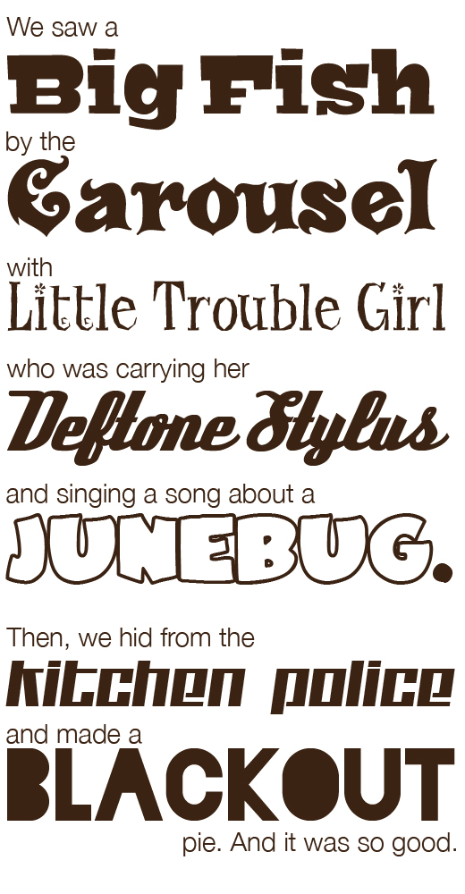
We’re Here for the Party Fonts
Turn on the disco light.
Today we’re introducing some funky, funky fonts.
These fonts steal the show, take over the stage and get your “we’re here for the party” message across loud and clear.
Use these make-a-statement fonts when your marketing materials call for completely overboard fun. They are free for commercial use via FontSquirrel.

What kind of story can you make with funky fonts like Bigfish, Carousel, Little Trouble Girl, Deftone Stylus, JuneBug, Blackout and Kitchen Police?