Graphic Design
Answers to 5 DIY Branding Resource Questions I Get Asked Most Often
Many of the questions I get about DIY design and branding center around what resources, tools, and software to use. Here are answers to 5 questions I get asked all the time.
PDF Design Software
Q: What software should I use to create my pdfs (freebies, worksheets, ebooks)?
A: Short answer: Word, Pages, InDesign, or Canva. Read 4 Software Options for Creating Beautiful PDFs and Documents for full details.
Fillable PDFs
Q: How can I create pdf worksheets will fillable forms?
A: Short answer: Acrobat Pro, PDFPen Pro, PDF Escape, Nitro Pro, CutePDF. Read How Can I Make Interactive and Fillable PDFs? for full details.
Stock Photos
Q: Where can I find inexpensive stock photos?
A: Short answer: Creative Commons, no-cost commercial use sites, Little Visuals, PicJumbo, Death to Stock Photo. More resources here under “Images” category.
Brand Colors
Q: I found a color I love online how can I get the color codes I need to use it on my site?
A: Short answer: Digital Color Meter (Mac) or Instant Eyedropper (PC). Read What’s That Color? for full details.
Brand Fonts
Q: I found a font I love! How can I figure out the name of the font?
A: Short answer: What the Font or Identifont. Read 2 Free Tools to Help You Identify Fonts for full details.
Have questions about branding, design, and software resources?
Ask away in the comments!
Need more in-depth help?
Using Mood Boards to Improve Design
Mood boards = better communication
Mood boards are one of the first things I have my branding clients and the do-it-yourself branders at Jewels Branch create for their brands. Whether you’re working one-on-one with a designer to develop your brand, or designing your brand yourself, mood boards make communicating important brand concepts easier.

Mood boards translate verbal descriptions (moods, feelings, values) into a visual presentation. This helps my clients show me exactly what they mean when they say things like: “I want my brand to feel fun.” or “I’m looking for a sophisticated bohemian look.”
My client’s visualization of “fun” and mine could be completely different and I want to see exactly what “sophisticated bohemian” means to them.
Mood boards help designers and their clients speak the same language: This is 100% crucial to the success of all branding and design projects.
Mood boards are a must-have for DIY branders
It’s the same if you’re a do-it-yourself brander.
As a DIY brander you’re both the client and designer of your brand, sometimes this is tough spot to be in! Putting together a mood board can help you translate the images of your brand that you have in your head into reality.
They can help you see more clearly the colors, fonts, types of images, and design elements that will visually show the range of feelings and values you want your brand to convey.
Making mood boards for specific marketing projects
Beyond big picture branding, mood boards play a crucial role in defining the look and feel of specific branding and marketing projects like opt-ins and e-books, product branding and sales pages, course materials, and more.
For these project-specific mood boards, the emphasis is a bit narrower than a mood board you’d create to capture the overall feel of your brand.
Instead, you’ll have more pieces that showcase how you want specific aspects of your project to look and feel.
Opt-in and e-book mood boards
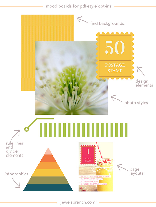
For instance, if you create a mood board (like the one above) for your opt-in freebie or e-book you’ll want to include inspiration from the world of publication design (magazines, brochures, e-books, annual reports, newspapers).
- covers
- table of contents
- anything that has specific design elements you like (divider lines, backgrounds, textures, etc.)
- page layouts
- infographics
- font combinations
- photo and typography combinations
- photo/illustration styles
Build your board on Pinterest
Pinterest is one of the fastest tools for pulling together design inspiration. You can search for “magazine design” or “magazine layouts” to get inspiration for the interior pages of your opt-in, for example.
See my awesome ebook board for more inspiration.
Opt-in Brilliance
We’ll be putting together mood boards, and creating opt-ins from start to finish, as part of Opt-in Brilliance, June 24 – 30 September 23 – 30. Come join us!

3 Steps to Beautiful and Useful Interior Pages in Opt-in PDFs, E-books, and Other Publications
Staring at words on the screen and trying to figure out how to design them so they look as good as they do in your mind can be overwhelming and frustrating. Even veteran designers get creative blocks when faced with a page full of text.
I use these 3 steps to break through creative blocks to design interior pages that are both useful and beautiful. Give these tips a try when you’re facing page design dilemma.
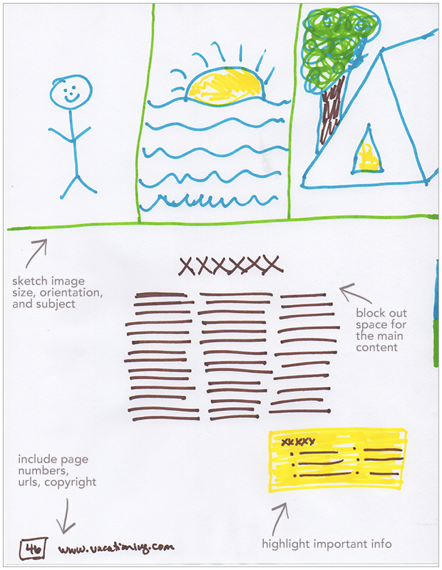
#1: Sketch It Out
When you put pen to paper it frees up serious brain power. Just drawing out where you want the different elements of content on the page (before you even open up a software program) will make your interior pages come together more quickly. You’ll be able to clearly see what kind of design elements and specific pieces of content you need to pull it all together in a nice package.

TIP: Colored markers make it fun! Also, do more than one sketch, to see how all the elements could fit together. Then scan your favorite sketch, place it in our document, and design over the top of it.
#2: Get inspired
It’s not where you take things from—it’s where you take them to. ~ Jean-Luc Godard
Start, and keep adding to, an inspiration file just for document design. Make a Pinterest board or start a folder on your computer. Collect examples of pdfs, opt-ins, magazines, flyers, catalogs, etc. that strike your fancy.
When you’re designing your own documents, you can go back through your inspiration file, soak it in, and follow the creative sparks that come.
TIP: Look for inspiration on Pinterest, Behance, Designspiration, search for book design, magazine design, brochure design, flyers, etc.
#3 Follow a formula
There’s no need to reinvent the world of document and publication design each time you start a new project. Examining how other documents are put together will help you write and structure your content, and decide what design elements you need.
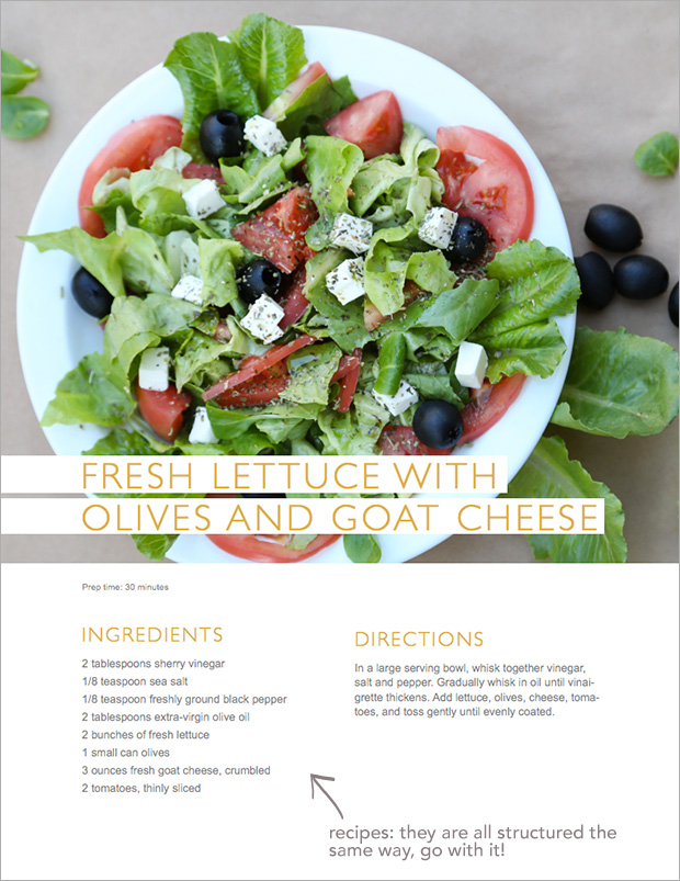
If you’re designing a recipe, look at how other recipes are structured in cook books and magazines. If you’re designing a fashion layout, look at how that’s done in your favorite magazine.

TIP: Keep it simple, deconstruct the elements that make up the content and design and use that formula to guide your own design project. For the recipe page above there are only 5 elements: a photo, recipe name, list of ingredients, directions, and prep time.
p.s. Feel free to laugh at my fancy drawing skills!