Brand and Be Seen: Copywriter
Brand and Be Seen is a series of blog posts offering brand style guides for fictional brands to inspire you to create your own beautiful brand. Feel free to use the font combinations and color palettes as you wish. Happy branding!
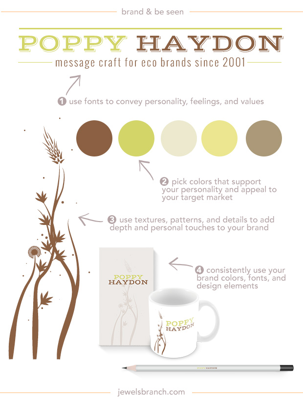
About the Brand
Poppy Haydon writes copy for eco brands. She has a thing for the redwood trees, ferns, and moss. Her clients choose her because she helps them craft messages that express their eco passions in modern, hip ways.
Details:
Logo: Vast Shadow
Tagline: Oswald
Hex Colors: #8c6043, #d3d568, #ede9ce, #ece690, #ac9979
Floral Elements: Aierbazzi font
More Brand and Be Seen…
Learn how to choose fonts and colors to best tell your brand story and build a website to match in The Brand Workshop
I love this! I’m fascinated by all the different ways to get your message across, other than through the written word. Thanks for sharing, Christie!
Anne, my favorite is combining words and visuals … very powerful and fun!
Really like this palette and I’ve signed up to polish my brand, your site is gorgeous.
Great to have you in Polish Your Online Brand, Sarah Lou!
Beautiful website. Love the font combinations and will help me with elevating my brand. Thank you!
Good to hear Brenda! I love playing around with fonts!
Awesome, love this – simple and easy. Thankyou
Thanks Kate!
oh, christie – everything you create is so exquisitely lovely. and i have been enjoying the “polish your own brand” workshop very much. thank you for your generosity and expertise.
So glad to hear that April!
Christie, this is awesome! It made me take a look at my website and made me realize there’s no consistent color palette… my pictures are in an earth, brownish tone, while my logo is colorful as I am… do you think that could be an appealing way to represent myself?
Victoria, the first things to check is if your photos match up with your message and values. Are they telling the story you want to tell. That’s more important to brand building overall than if they perfectly color matched to your logo.
great tip! thank you!!
Awesome!
Branding is such an elusive science – I definitely want to master.
Thank you so much 🙂
As I am trying to fine tune my brand and give it a makeover, this post couldn’t be more timely. Thanks for giving me some things to really think about!
Needed these tips today as I’m in the middle of rebranding and have been struggling with picking colors and design elements. Thanks so much for inspiring new ideas for me! 😀